Anytime you want to check if you are approaching the problem, just display graphs and tables on Stata.
Good afternoon Guys!
I hope that you are enjoying your Sunday afternoon and that you find your comfortably way out of your Stata dilemmas. Today we are going to play a bit with graphs and tables (in the second part). I will show you several helpful commands to present your data in a professional way. We will talk about several commands and ways of combining what we already learnt. Let’s start from the usual and friendly auto.dta!
Graphs
We can choose through different kind of graphs in Stata. The common ones are histograms and scatterplots but we will study also boxplots in order to gain a comprehensive understanding of every disposable tool.
Histogram
If we want to control the density of a variable or its frequency distribution, we can type:
histogram price
We get a simple histogram of the variable selected.
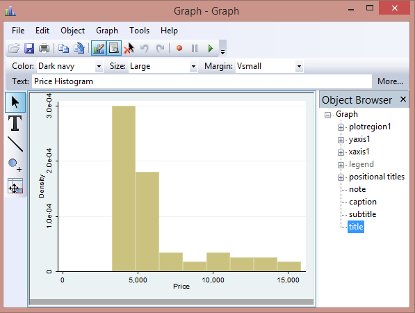
I have opened the graph using the graph editor that I mentioned firstly here, in order to show you how simple it is to select titles, subtitles, axis and colors. This is particularly referred to those of you that still believe Excel is the best program to display data! Histogram is a command that is assumed to be used on a continuous variable but you can also use it for discrete variable if you specify the option discrete. For example, we could be interested in creating a histogram for the categorical variable rep78. In this case, the midpoint of each bin labels the respective bar and the command you have to type is:
hist rep78, percent discrete
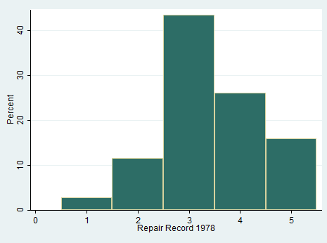
This command has other beautiful options that allow you to draw frequencies and overlay a normal density curve on the histogram. Curious? Try to type:
hist price, norm w(6100) freq start(0)
If you are interested in other magic stuff offered by this command, remember to use the help histogram.
What you need to know: You can also decide to create a two-way histogram on continuous (the default) or discrete variables. You may either visualize different histogram in the same plot region or combine different histograms into the same graph area. These are the possibilities:
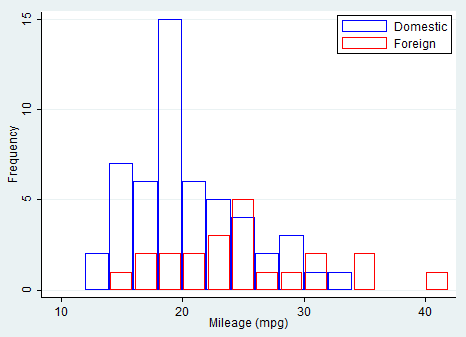
twoway histogram mpg, by(foreign, total)
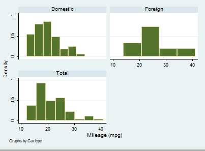
In this case, I asked Stata to show the frequency distribution of mileage divided by car type and in its entirety. Otherwise, you can delight yourself using a bit of programming and set all the characteristics your graph must have.
twoway histogram mpg if !foreign, start(10) width(2) freq bfcolor(none) blcolor(blue)|| histogram mpg if foreign, freq start(10) width(2) barw(1.8) bfcolor(none) blcolor(red)legend(order(1 “Domestic” 2 “Foreign”) pos(2) ring(0) col(1))
Homework: Yes, I am serious. Don’t panic, you can do it! Here is the code you must use:
graph bar mpg, asyvars over(rep78)bar(1, bcolor(yellow*0.4))bar(2, bcolor(yellow*0.2))bar(3, bcolor(blue*0.2))bar(4, bcolor(blue*0.4))bar(5, bcolor(blue*0.6))legend(row(1) title(“REP78”))title(“Mean MPG for rep78”)
gladder mpg, fraction // Extremely useful variable’s transformation
Your task is to play with it! Learning by Doing is my personal slogan; use it to improve your skills.
Homework for Excel Lovers: It’s time to recognize the defeat, time have changed and you have to move on. This is my task for you:
webuse citytemp
graph bar heatdd cooldd, over(region) blabel(total)
If you will have the patience to play a bit with the options Stata offers you, you will admit that any graph constructed with Excel can be obtained with a simple line of coding.
Kdensity
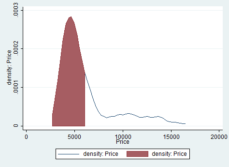
This command allow you to produce kernel density estimates and graph results. Let’s assume I want to check the variable price. I need to type something like this:
summarize price, mean
local mean= r(mean)
kdensity price, gen(x, h)
line h x, || area h x if x< `mean’
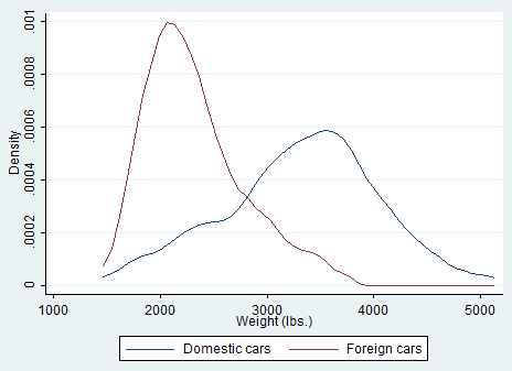
I also mentioned you could combine graphs for more than one variable. Kdensity allows you to do it but the command syntax is not that easy as it is for histograms.
kdensity weight, nograph generate(x fx)
kdensity weight if foreign==0, nograph generate(fx0) at(x)
kdensity weight if foreign==1, nograph generate(fx1) at(x)
label var fx0 “Domestic cars”
label var fx1 “Foreign cars”
line fx0 fx1 x, sort ytitle(Density)
Boxplot
These are extremely useful when you want to examine the distribution of a continuous variable. If this variable is normally distributed then the median that is represented by a line is in the middle of the box (the area between the 25th and 75th percentiles) and the ends of the extreme values (whiskers) are equidistant from the box. The command to obtain the boxplot thus allow you to check if your variable is skewed. Its syntax is:
graph box mpg, over(foreign) noout
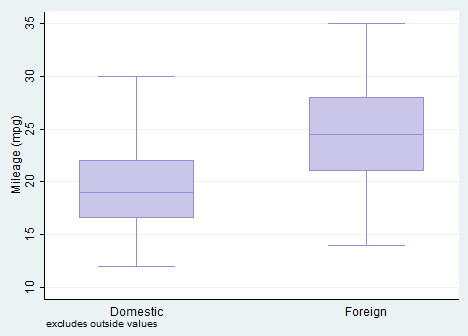
I asked Stata to show me the boxplot of mpg dependent on the car type in the same graph area and without outliers (noout). The boxplot support either the option by() or the option over(). I suggest you to check them out with the help command.
Pie chart
Another way to convince Excel lovers of Stata flexibility is by creating pie chart. Marketing students and professionals will appreciate its visual design. Also pie charts allow for different options. I used:
tostring foreign, gen(typecar) // I obtained a numerical variable from a string one
graph pie, over(typecar) plabel(_all name) title(“Cars Type 1978”)
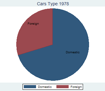
The over option creates a pie chart representing the frequency of each group of Car type. The plabel option places the value labels for Car type inside each slice of the pie chart. If you did not previously generated them, you can easily modify them after using the Graph Editor.
Twoway Scatter Plot
A two way scatter plot can be used to show the relationship between variables. Let’s open the example dataset census.dta and study the relationship among the urban population and the number of marriages accounting for every different regions.
twoway(scatter popurban marriage) (lfit popurban marriage), by(region) ytitle(Number of Marriages) xtitle(Urban population)
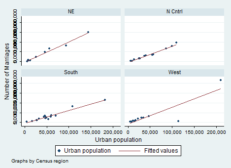
I introduced several options in the same command to present them all in a unique step (this post is already too long). You can play as much as you want with this command and I suggest you to try several times in order to see what changes with the options included. As expected, the relationship between urban population and marriages is positive and increasing. Scatter ask Stata to present a scatter plot whereas the regression line that predicts the number of marriages from the population is included by lfit. I decided to combine them but, in case you want just one of them, you can type:
twoway lfit popurban marriage
Another way to construct our graph, instead of dividing the sample by regions, is to add labels to the points labeling them by state of the census as shown below with the mlabel option on the scatter command:
twoway (scatter popurban marriage, mlabel(state2) ) (lfit popurban marriage)
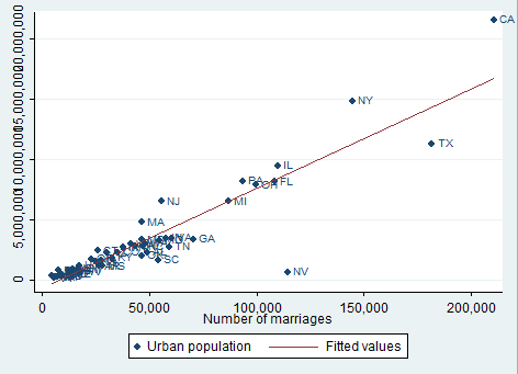
By doing so we can easily identify outliers. If you do not like the marker label position you can also change it with the mlabangle() option included in scatter after mlabel. Finally, we can request confidence bands around the predicted values replacing lfit with lfitci.
Can we combine two graphs? The answer is Yes, but the procedure is tricky. As before, I am going to add any useful option that comes out to my mind. The syntax become:
twoway (scatter price mpg) (scatter weight mpg) (lfitci price mpg) (lfitci weight mpg), by(foreign) legend(label(4 “Linear Fit”) label(5 “Linear Fit”) order(1 2 3 4 5)) name(scatter)
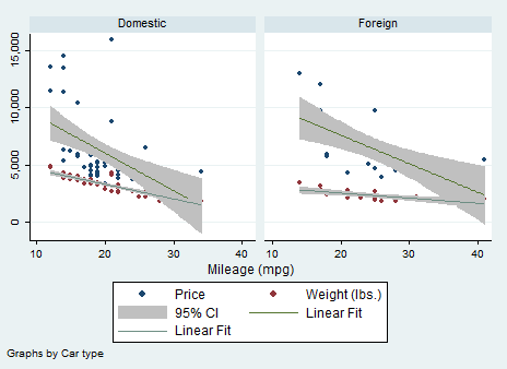
Here I told Stata to regress price and weight on mileage, include the confidence bands, divide the sample by Car Type and change the names displayed in the legend. Usually, at position 4 and five you can find “Fitted Values”. I personally dislike them so I changed them! The graph name is now scatter. Unfortunately you cannot rename your graph with more than a word like “That’s cool” but I know that, right now, you are feeling powerful due to all you have learnt. In the next post, I will explain you the basics of regressions and I will come back on graphs to show you Regression Fit Plots.
Others
Quantile, qnorm and pnorm are different useful graphs you can use if you want to investigate if your variable has, for example, a standardized normal probability plot. Having added them, we can consider our tour around graphs finished for today. I expect you to talk about Tables!